The Chicago Blackhawks is an older organization with a long rich history. Along with that storied history, the Chicago Blackhawks logo is one of the best logos in all of professional sports. With the team’s new found success, some of the newer fans might not know the entire story behind the Chicago Blackhawks logo. So, here’s a look at how one of the most recognizable logos in sports came to be.
The Beginning
To understand the significance of the Chicago Blackhawks logo it is very important to know how the team originally came about.
The Blackhawks were founded by Maj. Frederic McLaughlin when he purchased the rights to the team from Huntington Hardwick in 1926. McLaughlin’s family owned Manor House Coffee, a very popular brand at the time, but before the coffee business McLaughlin was an officer in the U.S. Army. The army part is important because McLaughlin named the Chicago Blackhawks after the Blackhawk Division, a unit he helped lead while in the Army. The unit was formed in World War I, but the war ended before the unit or Frederic saw any combat. The unit was named after Sauk and Fox Indian leader who actually fought against the United States government during the War of 1812 and then again in 1832.
Now that the team name was in place, the new NHL organization needed a logo. McLaughlin didn’t have to look far to find someone to create the new Chicago Blackhawks logo. His wife, Irene Castle, is credited with designing the first logo.
The Chicago Blackhawks Logo Throughout The Years
The initial logo was a hand drawn, black and white, Native head enclosed in a circle.
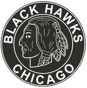
After nine years of rockin’ the black and white hand drawn logo, the Black Hawks, originally spelled as two words, added color to the face and hair of the Chief.
For many obvious reasons, the bright red Indian Chief face didn’t last all that long. After the 1937 season, the Blackhawks kept the original hand drawn logo but switched up the color scheme.
In 1956, the Blackhawks made the first significant changes to the logo. The outer circle was taken away and the Indian Head was changed to something that resembles what the logo looks like in present day.
During the time frame of 1956-1964 the Blackhawks also had an alternative logo which was basically the same as the one above, minus the the lettering and the circle around the Indian Head. This would eventually lead to the modern day logo.
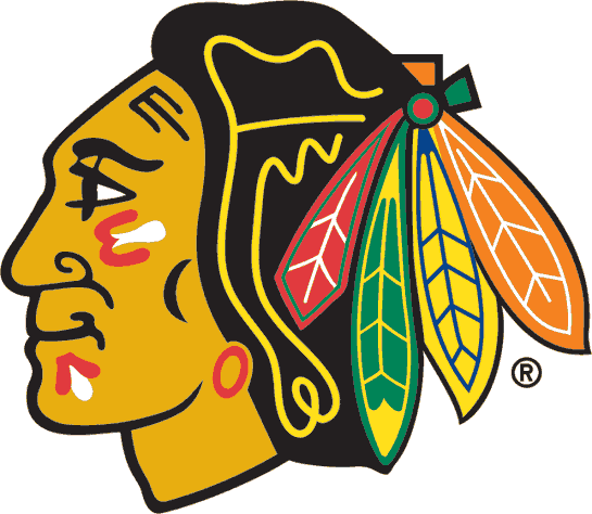
This brings us to the most current version of the logo, which is believed by many to be the best in sports. In 1964 the Chicago Blackhawks logo became what it is today.
How The “C” And Tomahawks Have Changed
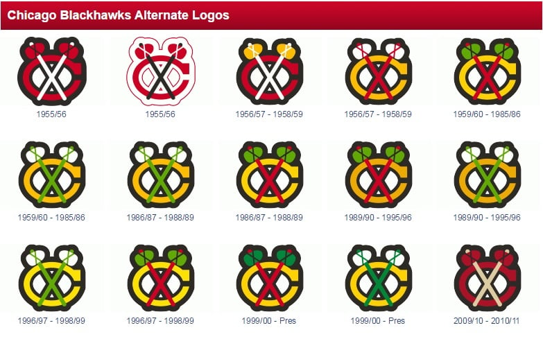
The main logo isn’t the only thing that has changed throughout the years. The Blackhawks secondary logo, the “C”, which stands for Chicago, paired with the crossed tomahawks has also gone through changes. The color schemes are most notably what changed throughout the years.
Additional Patches Throughout The Years
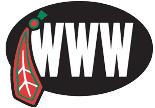
The Blackhawks haven’t had many additional patches added to the uniform, except this particular patch.
The patch was worn in 2007 in honor of long time owner William Wadsworth Wirtz. Bill Wirtz wasn’t the most popular owner to say the least, but his son Rocky, who is currently in charge of the Blackhawks, has made the team popular once again in Chicago.
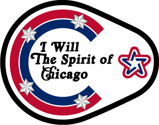
A lesser known patch that the Blackhawks have worn on their uniform is this one.
This patch was worn to commemorate the 200th Anniversary of the United States of America. First worn on January 17, 1976.
The Public Opinion
Now, many teams with Native American logos are being scrutinized for being “racist, ” but the Blackhawks haven’t really ran into that problem. Many believe it is because the team doesn’t depict a “cartoon-ish” likeness of a Native American. Also, the fact that the Blackhawks were named after a Army division helps to argue that there is no racist intent. The Blackhawks also refrain from imitating any Native American chants and/or traditions during the game. There is no “tomahawk chop” or other chants.
The Woman Behind Every Game Worn Jersey (Recent Years)
The Blackhawks logo doesn’t sew itself on to each jersey. Meet Josee Lemelin, from Quebec City, who has sewn the Indian Head on to Blackhawks jerseys for the past 23 years.
Ms. Lemelin’s favorite Blackhawk, Jonathan Toews, along with Duncan Keith, presented her with her very own sweater. pic.twitter.com/pA4zvCuW9w
— Chicago Blackhawks (@NHLBlackhawks) November 5, 2014
The Blackhawks organization has come a long way since the coffee tycoon created the team in 1926.


